For this exercise I found images related to:
- Dynamic
- Oppressive
- Confusing
- Refined
For the dynamic images, I found three, as shown below:
The first two contain diagonal lines which create the movement, whereas in the third image the diagonal is created by the skaters body.
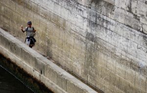
In the first image, the boy is running alongside a wall so the image at first seems flattened, however, due to the lower wall on the other side, the canted angle and the motion of the boy, there is still a sense of depth coming from the point where he would have entered the frame. There is very little colour in this image and yet the boy still manages to stand out from the wall. If this had been an image that I could control, I would have had the boy wearing a bright coloured shirt to help him stand out from the background. The lighting is natural daylight and taken with the sun directly overhead as there are no shadows. The lighting isn’t really contributing to the sense of depth or dynamism, rather it is flattening the texture of the wall which, at a different time of day, may appear more pitted and textured.
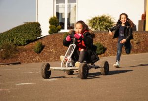
In the second image, the diagonal lines are the main driver for the movement; the angle of the go-cart, the sloping road and the right leg of the girl running. Yet again, the girl on the go-cart does stand out enough as the focal point but if it were possible, the image would have improved with her wearing a colour that separated her from the background. There is more depth in this image due to the background elements (house, bushes). This was taken in the early afternoon an so there are some shadows and some contrast, which contributes in a small way to the sense of movement. The same image taken later in the day with longer shadows may have given a greater sense of depth.
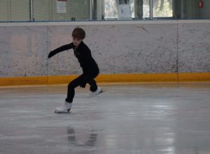
In the third image, where there is movement, I am not sure that there is a real sense of depth and so I included this image to analyse why this is the case. The skater is clearly in the mid-ground and the sides of the rink are in the background but still the image is quite flat. This flattening is partly due to the camera angle that is straight on to the skater but it is also due to:
- Very little contrast in the background and foreground (white/grey ice and side of rink and walls)
- Straight horizontal lines with no cues to perspective
- Even, dull light which doesn’t provide much contrast
Finding images that had depth and dynamics proved to be difficult, even more so adventurous or exciting (as per the exercise briefing). If the opportunity had existed to take any image, then two come to mind. The first is someone abseiling down a high cliff and the second is a rock concert with the image taken from below of one or more of the musicians.
For the oppressive images, I took these:
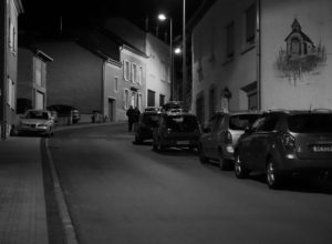
For the first image, I’m not sure if its oppressive or sinister, nonetheless it is the dark street with only a couple of street lights that contributes to this atmosphere. There are clear lines of perspective being created by the road, the cars and the buildings that winds up the hill. The two characters that are walking down the hill are visible as silhouettes and it is not possible (at this stage) to tell if they are a romantic couple of a hit squad but the black and white colouring contributes to the dark feeling that they might be a couple to be wary of.
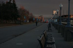
In the second image, there are similar perspective lines, but in this case they are straight, not curved as in the previous image. Yet again, another lone figure in the mid-ground creates a question mark, although in this case the figure looks lonely and less threatening. Ironically, the reality is the opposite – in the first image the characters are a middle-aged couple who were on their way to a restaurant, whereas in the second image, the character was far more suspicious, so much so that he was stopped by the police a few minutes after this photo was taken. The sense of depth is being enhanced by the way the light falls on the structures in the background. It was early morning and still quite dark and so only some buildings were being lit by the rising sun. What seems to help this image is that when the sun lit the buildings/structures it made the colour stand out quite noticeably – even though it was in the background, it still created enough separation with the foreground to give it depth. However, the image remains oppressive because the figure on the path remains in the bland darkness.
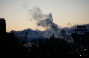
The third oppressive image is a bit more flat – there are no clear perspective lines however there are enough objects overlapping in the image to create depth – the crane, the trees, the buildings, the smoke. It is very early morning in this image and very cold (it’s in Montreal looking towards the docks, in winter!) – it reminds me a bit of a scene you might encounter in Blade Runner! The silhouettes are clear enough to see what the structures are but it is not light enough to see details – giving the impression (falsely, I might add) that there is no greenery in the location, that it is completely industrialised and oppressive.
The next set of images are the confusing set, one exterior and one interior:
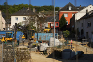
The first image is of a building site. There are lines of perspective on the right side showing a road (!) going up the slope, but the clutter of fences, building equipment and materials, houses and trees, trenches, etc. makes it difficult to see where the perspective lines are going. Clearly there is depth in the image as so many things are placed one in front of the other. The colour really helps to separate out the structures; very distinct yellows and blues are visible for different items. The sun is still low on the right of the frame giving a bit of contrast on the right side, but this is lost on the left side of the frame.
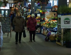
The second image has far more clear lines of perspective that are delineated by the sides of the various fruit stalls and even though the two characters in the mid-ground block these lines, there is enough uniformity for the viewer to understand where the perspective is. The confusion in this image comes from the multiple colours and objects in the stalls – fruit and vegetables, boxes, different types of stands. This is very a very different type of confusion to the first image which is derived from disorganized placement of objects; in this image the confusion can almost be called ‘organized chaos’ because it is a known and predictable environment – an indoor market. What further enhances the confusion is how the lighting is unexpectedly falling on the fruit and vegetables on the right, instead of the two characters in the mid-ground, who you would expect to be lit as the focus of the image.
The next image is for ‘refined’. I was not completely sure that I could find an image that had depth and signified refined, but this is what I came up with:

The image is an interior shot from the main hall in the Guggenheim Museum in Bilbao – this remains one of my all time favourite buildings. The depth is created almost exclusively by the way that the light is falling on the different surfaces, particularly the light that is coming in from the rectangular skylight in the background. The surfaces are all smooth and/or shiny with no clutter, which is what made me think of the image as refined. Another contributor to the refined image is the colour – all the surfaces are white but are reflecting the light slightly differently creating different tones and thereby adding to the depth of the image.
What is the best way to create depth in an image?
- Lines of perspective (straight or curved)
- Contrast in the image
- Objects overlapping each other to create fore-, mid- and background
- Light showing separation between objects
- Lighting that creates a ‘tunneling effect’
- High contrast in the foreground with low contrast in the background
- Different colours to separate objects
- Depth of field – blurring the background
- Framing the subject (through a door, through trees, through a field, etc.)
How important is visual depth to the overall feel of the shot?
The importance of visual depth must relate to what you are trying to communicate, the atmosphere that needs to support this and where you want the audience to be focused. In some instances, it will be important to communicate movement or excitement and this is often best achieved with images that have depth or room for the character to move in or the action to take place. Scenes often require a realistic setting, which implies that the images will have depth and the film-maker will need to use techniques that create this perception of depth. At other times, you may want the viewer to focus in on one subject one and then flattening the image may be the best way to achieve this.